
Supreme Yankees Box Logo Tee Legit Check Guide!
The Supreme yankees box logo tee is a fairly sought after piece, with it being one of the cheaper box logo tees on the market. If you’re looking to pick up one of these tees, you should know that there are fakes of this piece out there. I’ll be going over exactly how to make sure a Supreme yankees box logo tee is 100% authentic so you can avoid getting scammed for a fake, and taking the L. Starting off, there are 2 different batches of decent fakes made, but both have pretty big flaws which makes them fairly easy to legit check!
List of Current Flaws:
- Oval “P”
- Letter Thickness
- Word Placement On Tag + Tag Stitching
- Letter Spacing On Back of Tag
Oval “P”
This flaw applies to all fakes except one batch (Next flaw will target the one batch with the correct oval) and is one of the easiest ways to legit check these tees. For this flaw, we will be looking at the shape on the inside of the letter “p” inside the Supreme text. On the real tees, the shape inside the “p” will be a complete full oval, but on the fakes the oval will be cut off by a straight line on the left side of the oval, so it can’t make a full oval. If the oval inside the “p” is cut off and not a full oval, it’s fake.
Here’s an example picture:
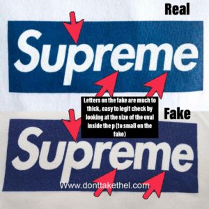
Letter Thickness
This flaw applies to the only batch of fakes with the oval “p” flaw fixed. And even though this batch has the “p” fixed, this batch may even be worse than the other. This flaw is exactly how it sounds, all of the letters are much to thick on this batch of fakes. It can be a little harder to see if you’re not super familiar with the font that makes up box logo tees, but side by side you should definitely be able to see the difference. The first thing to look for is the size of the oval inside of the “p”. Because the letters are to thick, the oval inside of the “p” will be smaller than it should be. The other letters are also noticeably thicker than they should be.
Here’s an example picture:
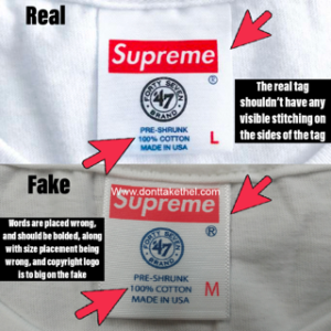
Word Placement On Tag + Tag Stitching
Starting off the letters on the fake tag are spaced wrong, and should be bolded. The copyright “R” logo is also to big on the fakes. One of the easiest things to check is the stitching on the sides of the tag. The real piece shouldn’t have any visible stitching on the sides of the tag, but on the fake tag there’s very visible stitching around it.
Here’s an example picture:
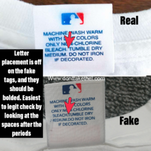
Letter Spacing On Back of Tag
For this flaw, we will be looking at the letters on the back of the tag. On the fake tag, the letters are placed wrong, and should be bolded. The easiest way to legit check the back of the tag is by looking at the spacing between the sentences (after periods). The real tee has a good amount of space after each period, before the first word of the new sentence. But on the fake, there’s no spacing at all between the period and the next word.
Here’s an example picture:
Hope this helped you guys legit check a Supreme yankees box logo tee!