Supreme 20th Anniversary Box Logo Tee Legit Check Guide!
If you’re in the market for a Supreme 20th anniversary box logo tee, you should know that their are tons of fakes of this piece on the market. This is one of the most commonly faked box logo tees. As with a lot of other pieces, fakes have recently gotten fairly accurate of these tees. But as always their are some key elements missing which can help us to authenticate these tees. Today, we’ll be teaching you guys exactly how to make sure it’s a legit piece from Supreme so you can avoid getting scammed, and taking the L.
List of Current Flaws:
- Letter Spacing
- Double Stitched Tag
- Tag Logo Color
- Glossy Box Logo
Letter Spacing
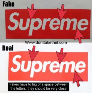
For this flaw, we will be looking at the spacing of the “Supreme” letters on the box logo.
On the fake tees, the letters are slightly to far apart on all of the letters. On the authentic tee, the letters should be very close together. This flaw can be hard to see without HQ pictures of the box logo, which I’d always recommend getting if you’re looking to buy one of these. This is one of those flaws that can be hard to see at first, but after looking at the comparison for a while you should be able to legit check these tees fairly easily based off of this flaw. It’s usually most noticeable in the last “e” which is typically noticeably to far away from the “m”.
Here’s an example picture:

Double Stitched Tag
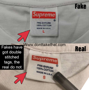
For this flaw, we will be looking at the stitching on the sides of the tag inside of the neck.
On the fake tags of this piece, the tags will be double stitched which if you’re not familiar with the term double stitched it’s exactly how it sounds, with 2 lines of stitching down both sides of the tag. On all of the authentic tags for the 20th anniversary box logos, there should only be one line of visible stitching on the tag. This will always be a dead giveaway of a fake, and none of the replicas have the proper single stitched tag.
Here’s an example picture:

Tag Logo Color
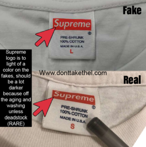
For this flaw, we will be looking at the tag inside of the neck again. The red color of the box logo and the size will be a darker red color on the authentic pieces based on the wear and aging the shirt has gone through. The fake tags will have a way brighter red color on the box logo and the size. All authentic tags will be darker unless the tee is completely deadstock, which is pretty rare to find these deadstock nowadays. I would only purchase a deadstock one from a trusted seller who’s known in the community for being a legitimate seller.
Here’s an example picture:

Glossy Box Logo
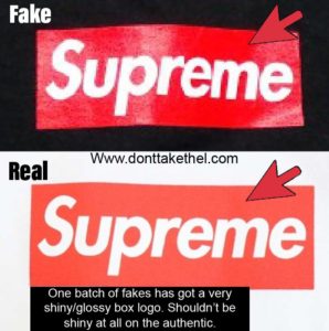
This is an extra flaw which only applies to one batch of fakes which can sometimes have the letter spacing flaw fixed. But luckily this logo is a lot more messed up than just the letter spacing flaw and is super easy to legit check on this batch.
This flaw should be very obvious if you’ve ever seen the box logo on the authentic tee, but worth mentioning for anyone unfamiliar. Basically this batch of fakes just has got a very shiny/glossy finish to the box logo. While on the authentic piece it should not be shiny or glossy at all. This is an instant sign of a fake tee.

Hope this helped you guys legit check a Supreme 20th Anniversary Box Logo Tee!
